A question in a recent DM conversation prompted me to consider that I’ve not done something like this for “Finding Dee” in a LONG time. As such, I decided to put together a (hopefully) fun sneak behind the scenes of how the proverbial sausage is made!
I used to keep a little notebook with me where I’d jot down brain farts, doodles and ideas for new strips. However, after YEARS of having to look back at those notes and think “Uh… what the HELL do those chicken scratches even MEAN!?”, I decided to just start keeping an open file on my Google Docs.
In here, I make a more detailed script of each strip idea, often with written “stage” direction so that when I’m drawing, I know what all I’ve got planned for each strip. This also helps to reduce typos since I’m no longer WRITING the script when I’m lettering it in Photoshop.
Here’s a screengrab of a script for a somewhat recent, Transformers-themed homage I did:
It’s my standard, 5-panel arrangement with some descriptions and notes, with all the text worked out. From this point, I open up one of my templates.
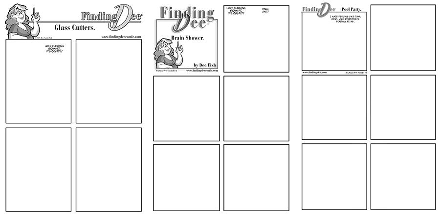
I build the strips in Photoshop using a series of premade, layered templates. that already have all the logos, legal copy, title card art, panel borders, text blocks, and more. I generally use one of three different templates for any given strip.
I use these mostly to, A, save me a little time. And B, keep the strip EASIER to adapt for panel-by-panel reading on smart phones and on Instagram. Weird shaped panels make that a little harder, so while I’d PREFER page layouts that are more exciting, forcing myself into templates makes the strips easier to read on devices.
So, I open the template that fits the needs of my script and go from there. Once open, the first thing I do is enter the text from the script. Any captions or dialogue is dropped in FIRST so I know exactly how much space I’ll have to draw in.
And in the case of THIS strip, once I did that I decided that the 5-panel layout wasn’t as good as the 6-panel one.
Panel 5 could now be devoted to a silent beat of Mewsikeen about to leap up and help build anticipation and, hopefully, humor. Here, you can ALSO see that my scripts OFTEN get changed on the page as ideas get refined and punchlines get punchier.
Now that I know where the dialogue NEEDS to go, I can go to roughs. For my roughs, I have a pre-made layer in each template called “SKETCH”. This is the layer I do my sketchy roughs on and I use a “Layer Style” in Photoshop to make it a pale blue.
For those of you who don’t use Photoshop, I GET it. But I am also a graphic designer, and I need to work in the software that is the industry standard to do my job, soooooo I’m stuck with it, and might as well get my money’s worth. Plus, Clip Studio Paint still doesn’t have layer styles.
My roughs are VERY rough! I keep my sketches loose, flowing and fun. I do most of the work in the inks, so try to keep these as loose as possible. Where things repeat, like the desk and shelf here, I will copy/paste elements as needed for visual consistency.
In the last panel, you can also JUST see the faint ghost of my panel 5 body under the panel 6 sketch. I’ll copy the bodies from panel to panel, erasing them at about 80% so I can maintain body proportions from panel to panel easier when I draw new poses.
After this, I move on to inks, or digital rendering, for the pedants in the audience. At this stage, I move a flattened version of this art, ALL in blue, into Clip Studio Paint at 600dpi.
I use, mostly, a brush called “Lando Calbrusian” I got from Frenden'. It’s a great, smooth, juicy brush that gives me the exact line I want when I’m inking. Love it!
While you can see that the DESK is copied and pasted, the background shelf isn’t inked yet. THAT, I draw on a separate layer with a slightly gray line so it visually separates from the foreground art later. This is important since, by design, that shelf is LOADED with toys that would otherwise make the panels too visually cluttered.
I copied and pasted the filled shelf and then just erased the toys I knew the kitty would displace.
Bringing the line art BACK into photoshop, I apply the gray tones. Since the strip is generally in black & white, I actually have preset layered in my Photoshop document for each specific tone. There are about 5 or so that I use most often and each is just a percentage of black. My hair is a layer set with a black layer style set to 20% opacity. For my shirt it’s 40%. Heidi’s shirt is 60% and I use a 75% black for any background fades as seen in shots like THIS panel:
Now, I will set a MASK up over this layer and then use the “Rough Round Bristle” brush in Photoshop set at 10% to wash the dark background away in this painterly look that I like.
I use this same brush on a layer called “Shadows” with is black, set to 20% opacity and hand draw the shadows as seen in the panel above.
From there, I add the word balloons which, usually, are hand drawn as seen here in panel 6. This strip, however, uses more mechanically ones I built as vector shapes to more resemble the lettering style of the old Marvel Transformers comics.
I also took the “KADOOM!” sound effect and made it part of the panel border so it bled to white. (As seen above, I regularly draw the panel balloons open for the same effect when they overlap the panel borders. I just like the way it looks.)
Now, for THIS strip, I also used the brush “Kyle’s Screentone 38” for the screentone effects in the first 4 panels, as it felt more “old school comic”. I RARELY use this, however, since the effect moirés badly on screens when viewed small.
So that’s about it. That’s a step-by-step of how I make each “Finding Dee” comic strip every week! I hope you enjoyed the peek behind the scenes and enjoy the NEW strips every Monday here on Substack or at www.findingdee.com!


Yes, I did find that interesting and inspirational. Keep up the good work