In DEEfense of: Line Weights
How a thicker holding line can help emphasize depth in a static comic panel.

While there is an infinite variety of different drawing styles, all of which have distinctly different “rules” and tips to improve how effectively they communicate, there are some concepts that are useful across multiple styles.
And regarding cartooning, one of them that I really believe in is the value of varying your line weights.
Personally, I love the fluid, thick/thin lines of cartoonists like Walt Kelly, Jeff Smith, etc. Juicy lines that convey the roundness of form, volume, and organic shape. To me, that style of inking just looks more… alive. It’s a style I’ve struggled to get better at for my entire career
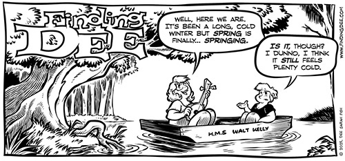
.This style generally emphasizes imparting volume, but also helps to enhance the illusion of a light source even without rendering by adding additional thickness on the sides of forms that are opposite of the light source.
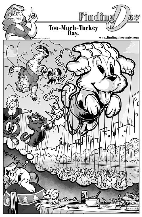
In the POGO homage image, there are multiple planes of art that help to impart depth. The tree and shrub in the forground has the thickest lines around them, and the outlines on the trees in the distance are thinner, and broken
There are plenty of cartoonists who also do amazing things with what is called a “dead line”, which is to say a line with uniform thickness. MOST tv animation does this, and a lot of cartooning, as well. But even with a dead line, line weight can still be used to help to establish depth and perspective.
But even with a dead line, you can use slightly different line thickness… uniform for each layer… to help enhance the feeling of depth in a scene.
Yes, color makes it easier to differentiate levels in your art, but a thicker line can help push a character closer to the reader. It replicates the optical tricks of objects being closer to your eye being sharper and more focused, and far away objects fading back.
A thinner line, or even a broken one, says “background”, while a more solid, chonky line helps transform “lines” into “objects” and flat drawings into windows into a reality.
So I’m back to tell you that I applied this to my most recent comic. I’ve been using a dark grey line for the background and black for the foreground, but this week I also made the background lines a little thinner and I like it! Thanks for the tip! ✨
It looks like a lot of fun to mimic others' styles. I don't cartoon, don't have the ideas or the vision, but I love what you do.